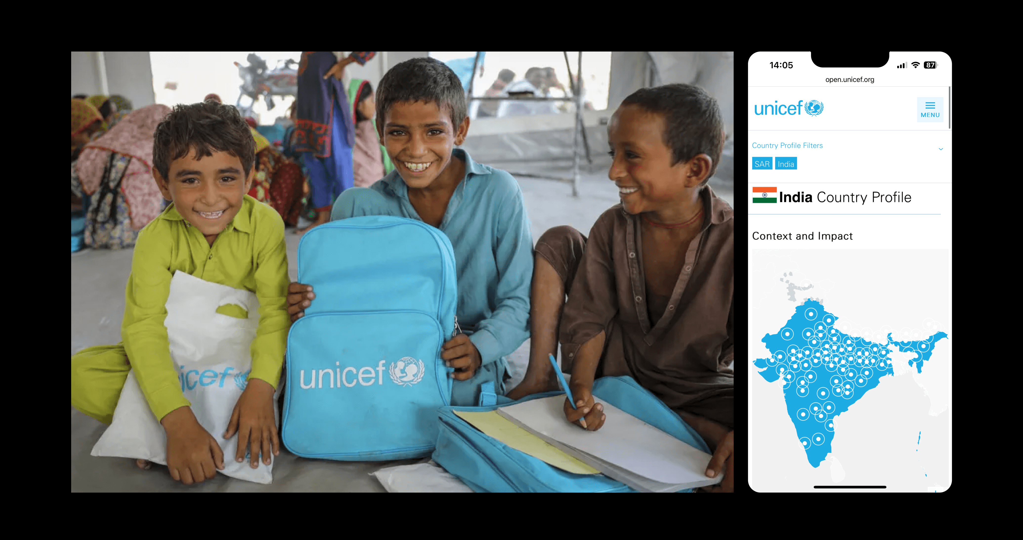
There cannot be transparency without accessibility. From this understanding, we worked to redesign the UX, UI, and narrative of the UNICEF Transparency Portal so they could present their data in a more human and approachable way.
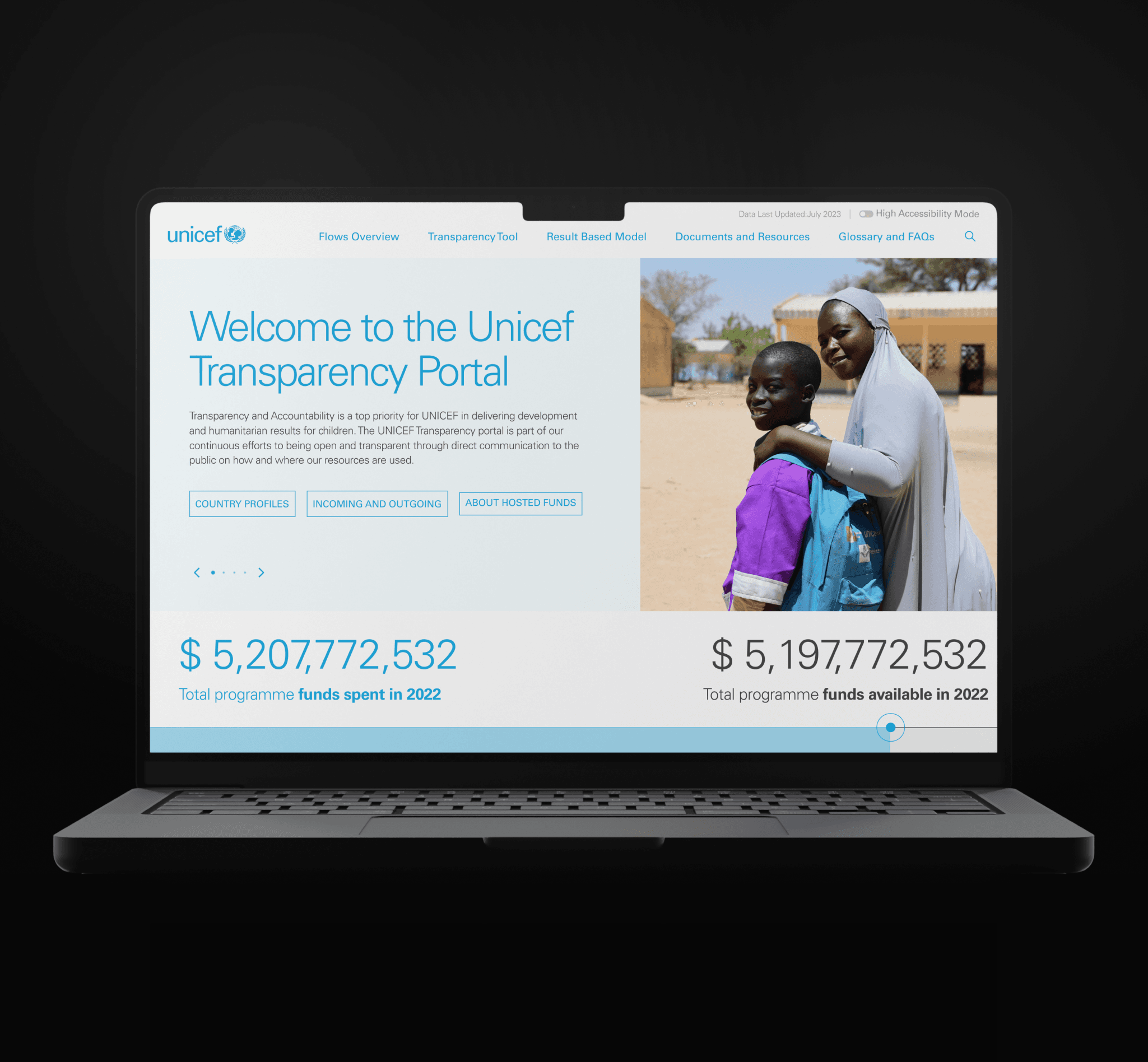
We set out to make UNICEF's results and spending information accessible to a wider audience. To achieve this, we revamped their data presentation to emphasise the tangible real-world impacts behind their expenditure, rather than just the figures themselves.
We were handling a huge quantity of variable data that required us to design an extensive range of visualisations. This process had to be carefully managed to ensure all stakeholders were aligned and felt the platform met with their needs and concerns.
We began by conducting workshops with various stakeholders to understand their needs and prioritise features. These sessions allowed us to delve into the technicalities of their ecosystem and familiarise ourselves with the language they use to describe their data.
In the development phase, we first aligned in terms of maintenance tasks. As we were building on the previous portal and not from scratch, we needed to first improve some elements of the platform before starting to develop the new frontend. This meant changing the way the data was managed and input into the platform.
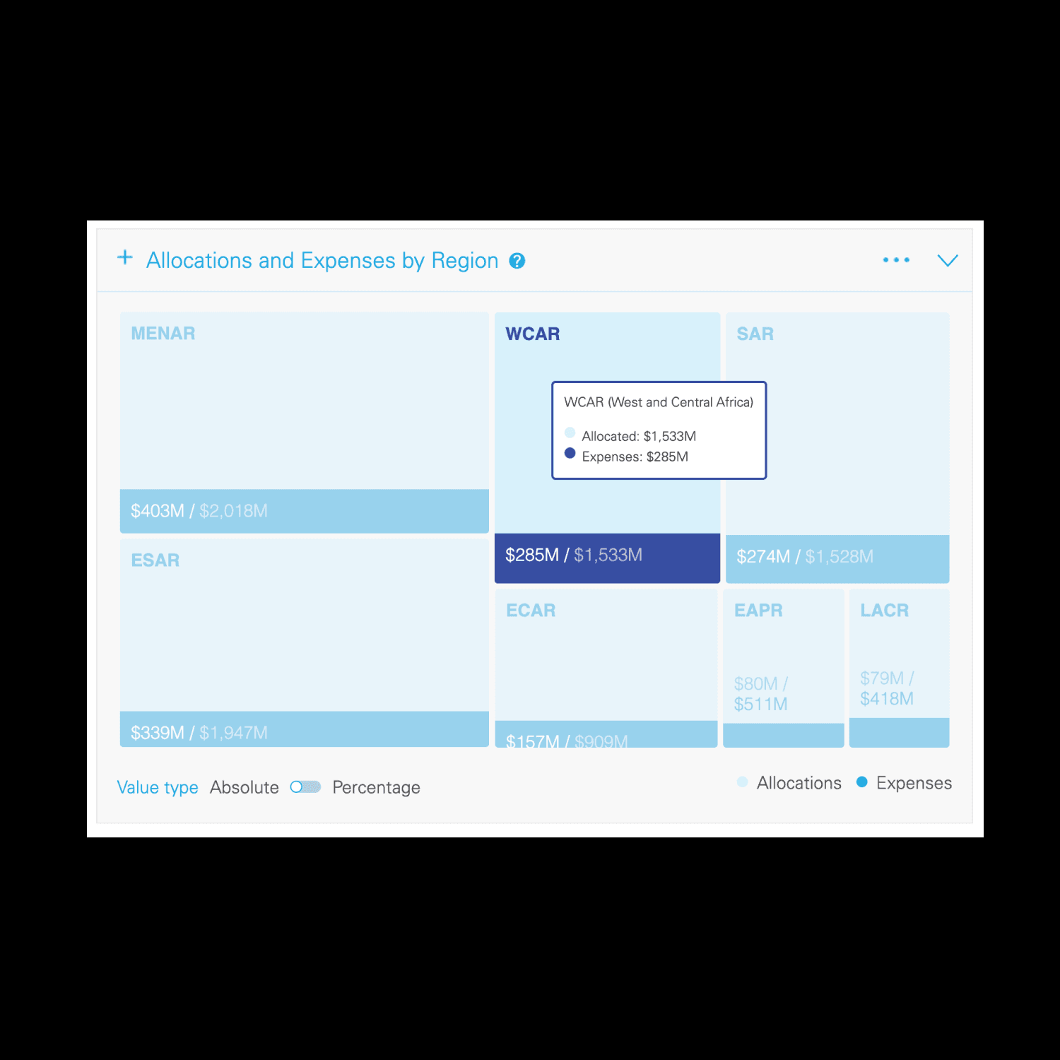
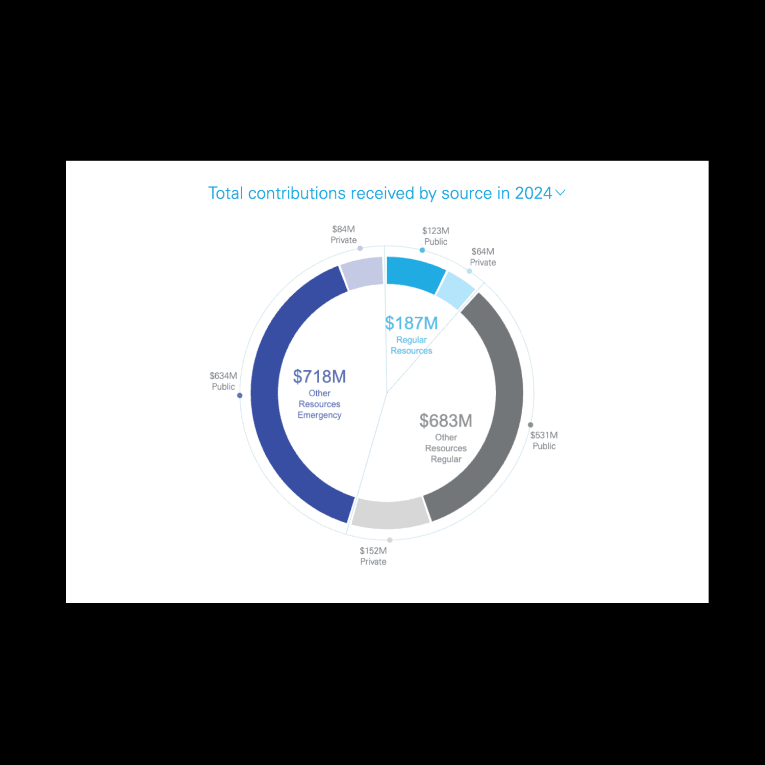
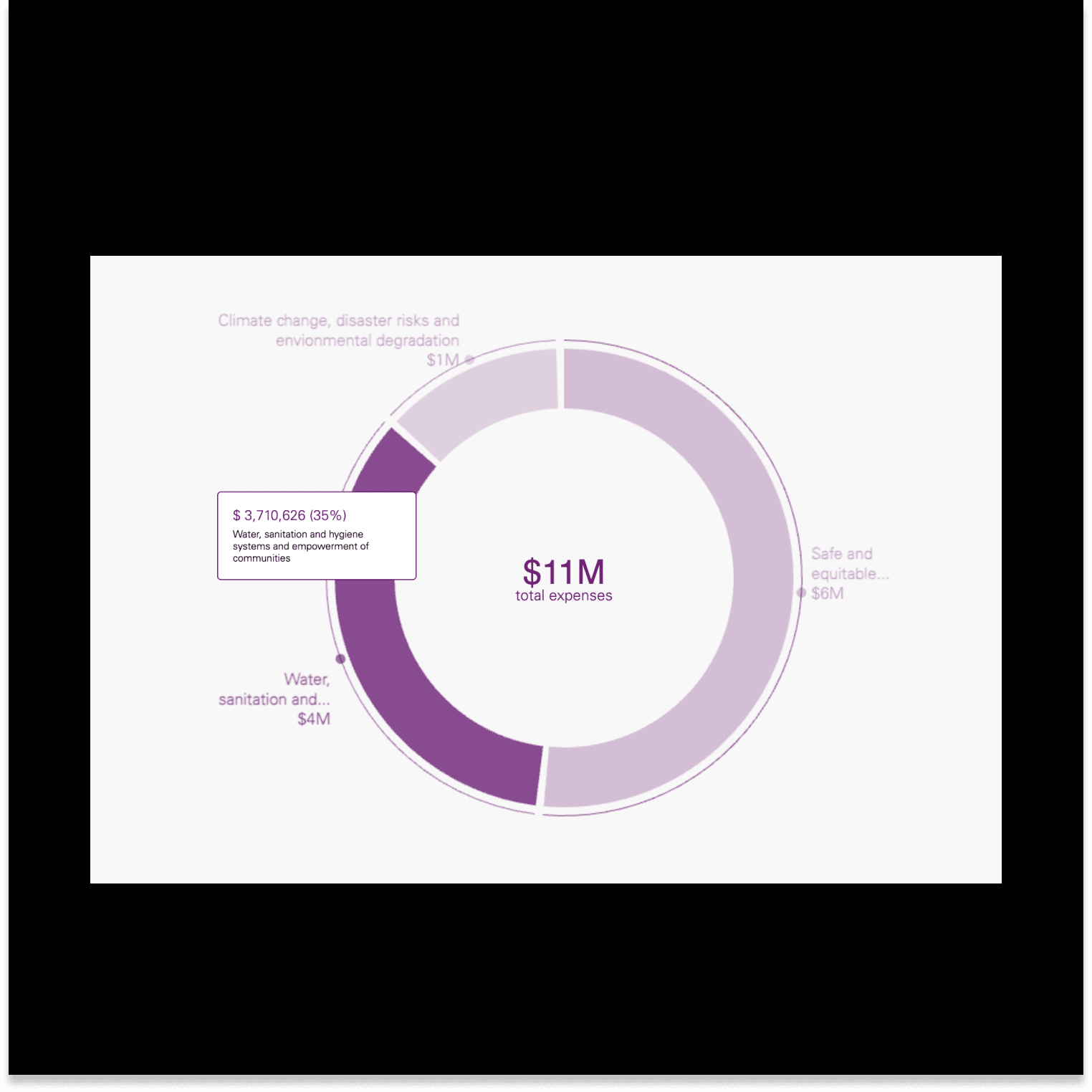
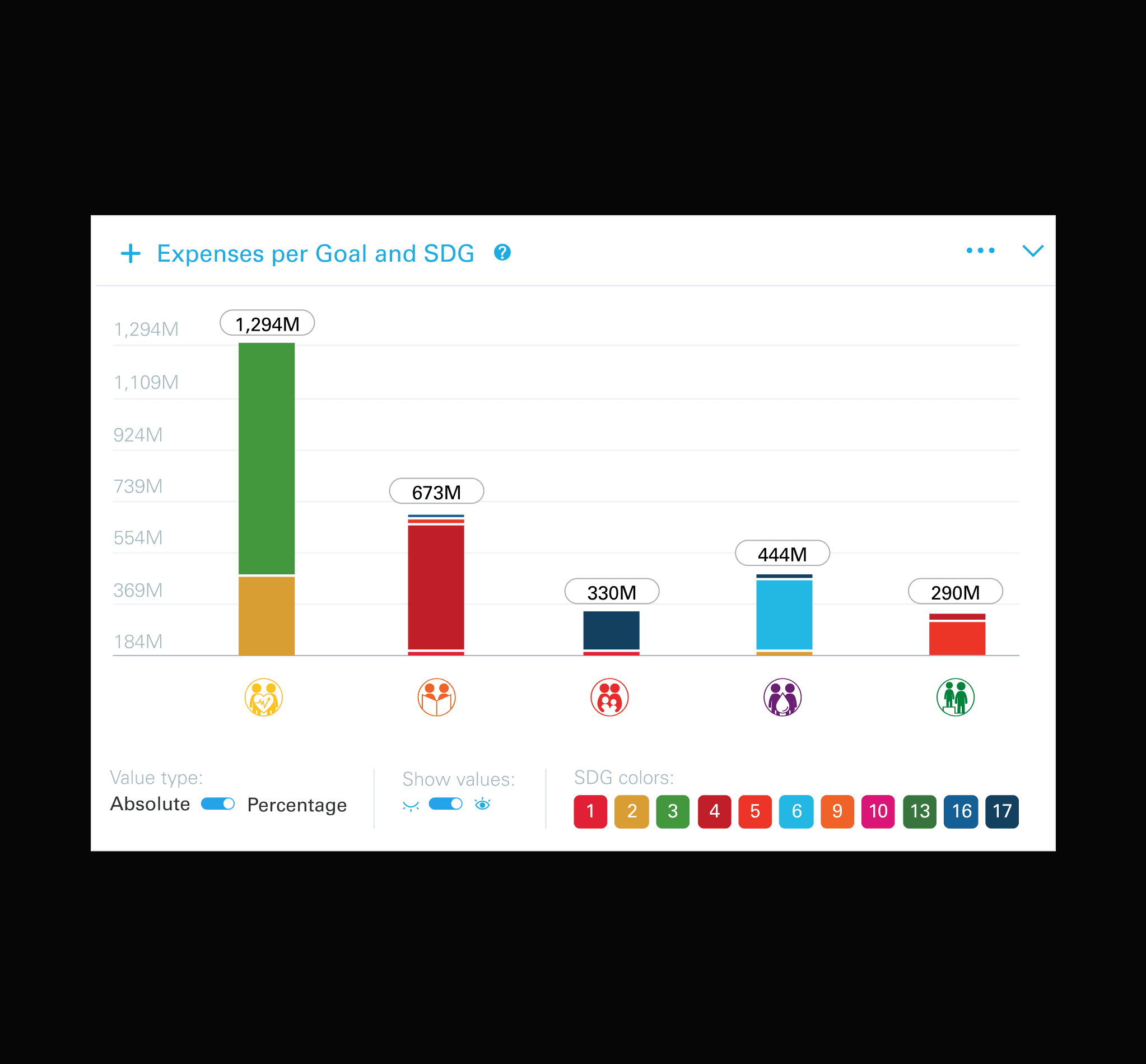
In the process, we placed an emphasis on stress-testing the data visualisations to ensure they performed well across diverse scenarios. Incorporating variable data from many different countries required us to meet high standards of performance.
For example, the visualisation below had to handle a wide range in the number and size of items, as well as significant variations in the length of text for each item.
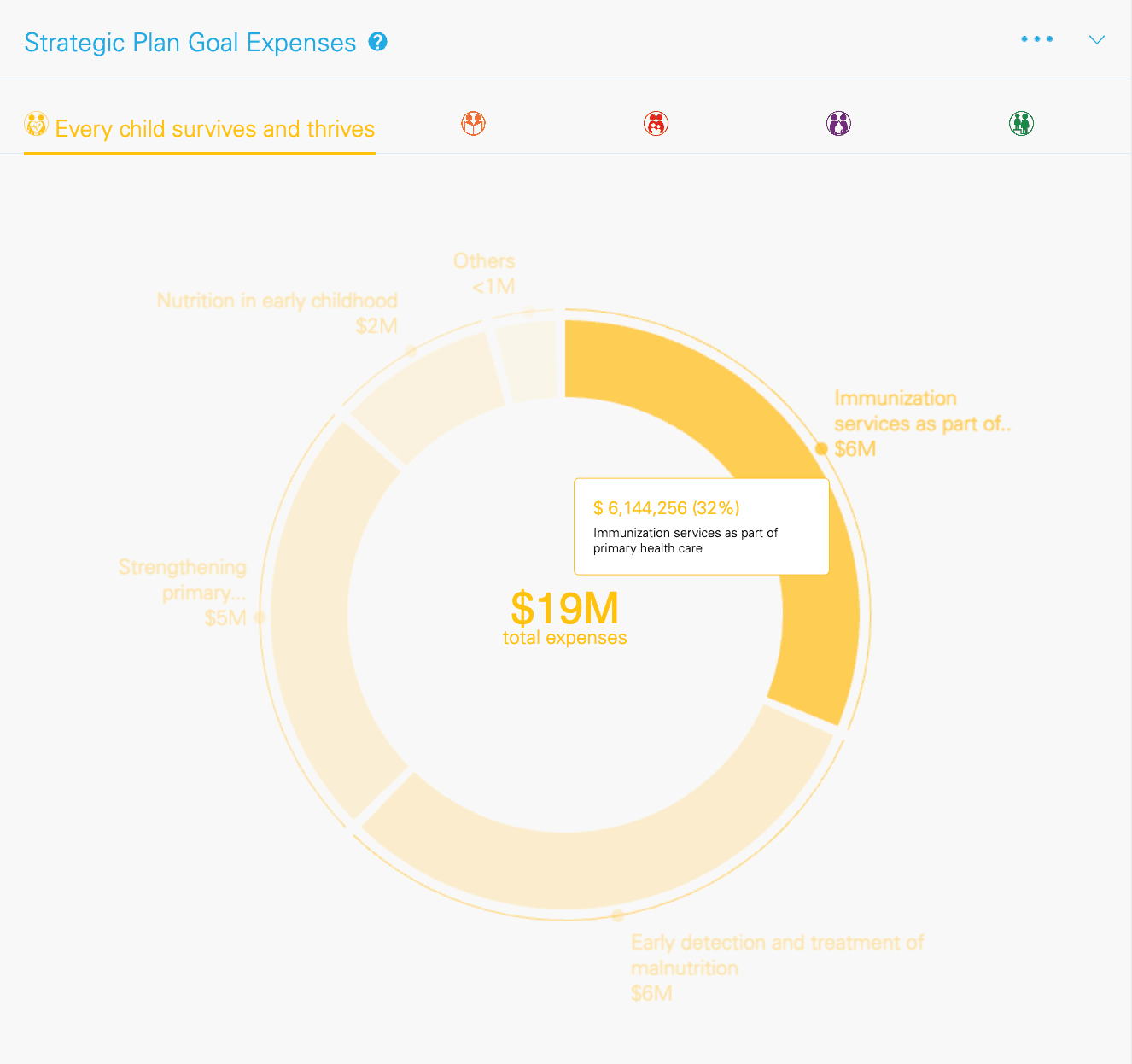
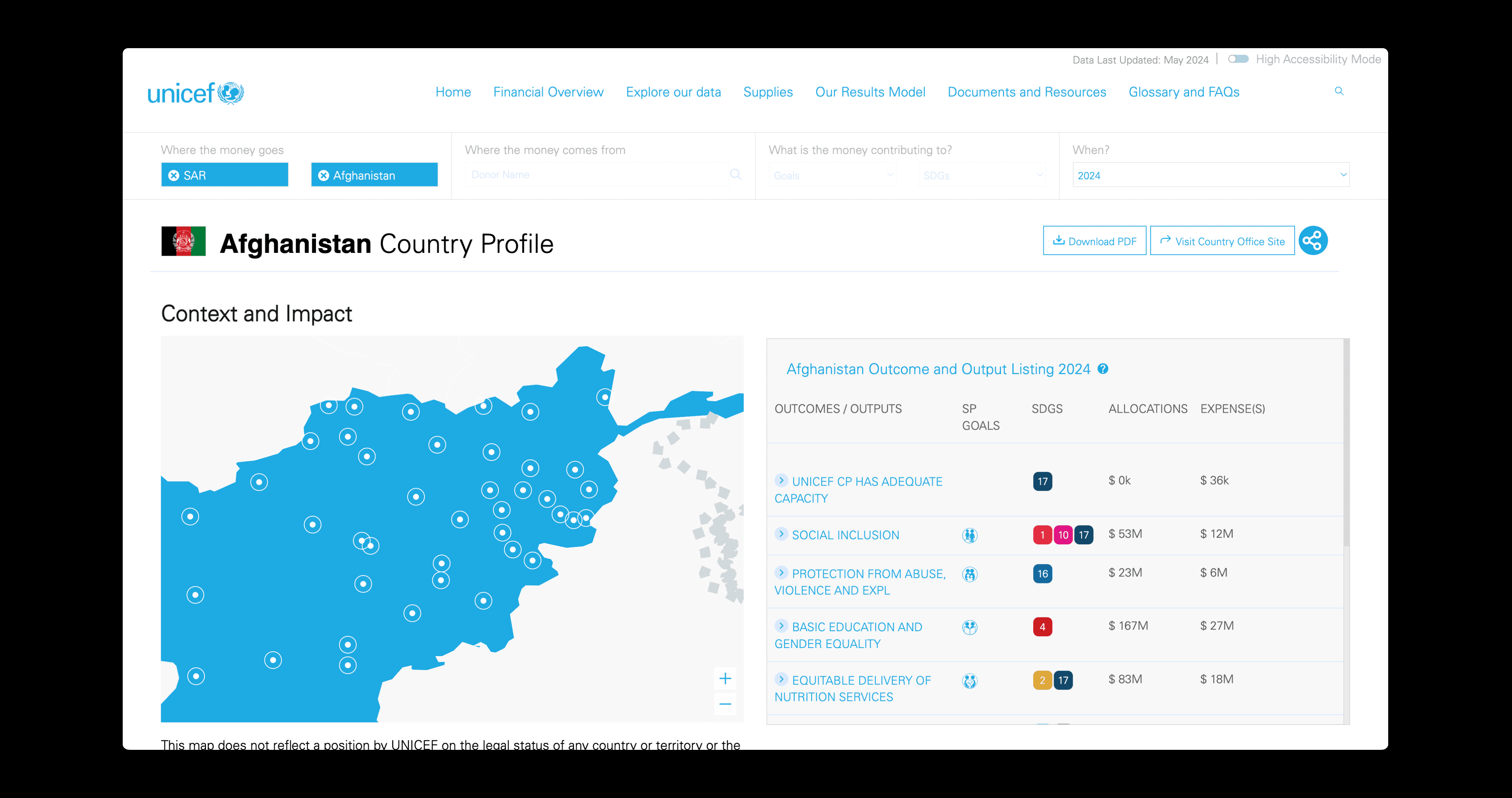
Users of the web portal are now able to explore how much is being spent and where through interactive tools and simple, relatable language. The data is easily divided by regions, objectives, and origin to facilitate transparency and allow users to find the information they need as quickly and accurately as possible.
